At the beginning of the fourth quarter of 2015, only the Consumer Staples sector earns an Attractive-or-better rating. Our sector ratings are based on the aggregation of our fund ratings for every ETF and mutual fund in each sector. See last quarter’s Sector Ratings here.
Investors looking for sector funds that hold quality stocks should look no further than the Consumer Staples and Information Technology sectors. These sectors house the most Attractive-or-better rated funds. Figures 4 through 7 provide more details. The primary driver behind an Attractive fund rating is good portfolio management, or good stock picking, with low total annual costs.
Attractive-or-better ratings do not always correlate with Attractive-or-better total annual costs. This fact underscores that (1) cheap funds can dupe investors and (2) investors should invest only in funds with good stocks and low fees.
See Figures 4 through 13 for a detailed breakdown of ratings distributions by sector. See our ETF & mutual fund screener for rankings, ratings and reports on 7000+ mutual funds and 400+ ETFs. Our fund rating methodology is detailed here.
All of our reports on the best & worst ETFs and mutual funds in every sector are available here.
Figure 1: Ratings For All Sectors
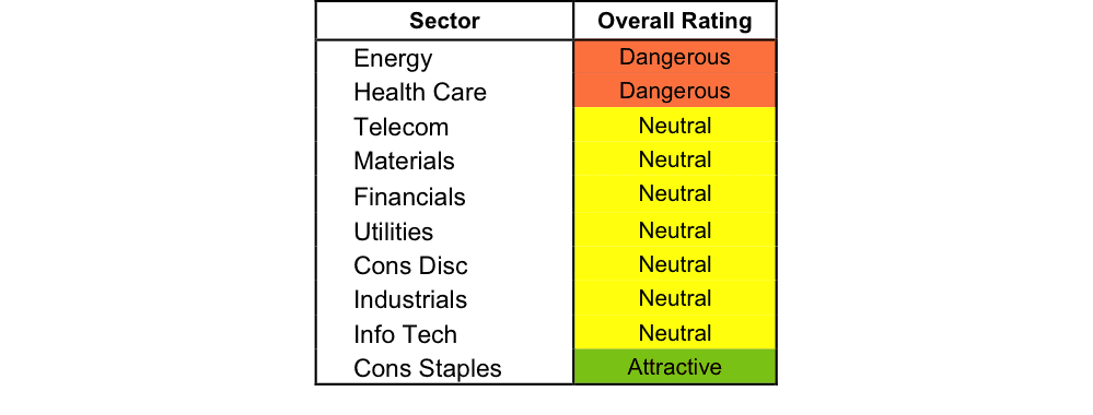
Source: New Constructs, LLC and company filings
To earn an Attractive-or-better Predictive Rating, an ETF or mutual fund must have high-quality holdings and low costs. Only the top 30% of all ETFs and mutual funds earn our Attractive or better ratings.
State Street SPDR Consumer Staples Select Sector Fund ETF (XLP) is the top rated Consumer Staples fund. It gets our Very Attractive rating by allocating over 39% of its value to Attractive-or-better-rated stocks.
Wal-Mart Stores (WMT: $65/share) is one of our favorite stocks held by XLP, earns our Attractive rating, and was recently featured as a Long Idea. Since 1998, Wal-Mart has grown after-tax profit (NOPAT) by 9% compounded annually. Wal-Mart has been a staple of consistency in a highly competitive industry by generating a 12% or greater return on invested capital (ROIC) in every year since 1999. The market has not rewarded this consistency however, and WMT is significantly undervalued. At its current price of $65/share Wal-Mart has a price to economic book value (PEBV) ratio of 0.7. This ratio implies the market expects Wal-Mart’s profits to permanently decline by 30%. Not only does this expectation ignore the track record of Wal-Mart, but it also discounts the steps being taken to remain the retail leader for long into the future. If Wal-Mart can grow NOPAT by just 2% compounded annually for the next five years, the stock is worth $108/share today – a 66% upside.
Professionally Managed Portfolios BP Capital TwinLine Energy Fund (BPEAX) is the worst Energy fund. It gets our Very Dangerous rating by allocating over 49% of its value to Dangerous-or-worse-rated stocks. Making matters worse, it charges investors annual costs of 4.63%.
Patterson UTI Energy (PTEN: $14/share) is one of our least favorite stocks held by BPEAX and receives our Dangerous rating. While most oil & gas companies have had a troublesome 2015, Patterson’s troubles began much earlier. Since 2011, Patterson’s NOPAT has declined by 18% compounded annually while the company’s ROIC has fallen to a bottom quintile 3% from 7%. Despite shares being down around 30% over this same timeframe, the expectations baked into the current stock price remain overly optimistic. To justify its current price of $14/share, Patterson must grow NOPAT by 7% compounded annually for the next 14 years. This expectation overlooks Patterson’s NOPAT decline over the past few years as well as the current headwinds facing the entire oil & gas industry. Investors would be wise to avoid PTEN.
Figure 2 shows the distribution of our Predictive Ratings for all sector ETFs and mutual funds.
Figure 2: Distribution of ETFs & Mutual Funds (Assets and Count) by Predictive Rating
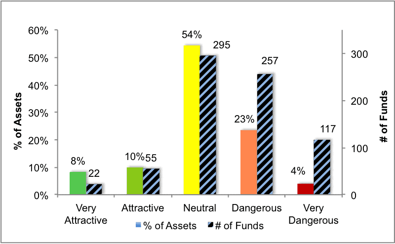
Source: New Constructs, LLC and company filings
Figure 3 offers additional details on the quality of the sector funds. Note that the average total annual cost of Very Dangerous funds is almost 11 times that of Very Attractive funds.
Figure 3: Predictive Rating Distribution Stats
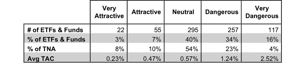
* Avg TAC = Weighted Average Total Annual Costs
Source: New Constructs, LLC and company filings
This table shows that only the best of the best funds get our Very Attractive Rating: they must hold good stocks AND have low costs. Investors deserve to have the best of both and we are here to give it to them.
Ratings by Sector
Figure 4 presents a mapping of Very Attractive funds by sector. The chart shows the number of Very Attractive funds in each sector and the percentage of assets in each sector allocated to funds that are rated Very Attractive.
Figure 4: Very Attractive ETFs & Mutual Funds by Sector
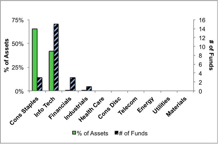
Source: New Constructs, LLC and company filings
Figure 5 presents the data charted in Figure 4.
Figure 5: Very Attractive ETFs & Mutual Funds by Sector
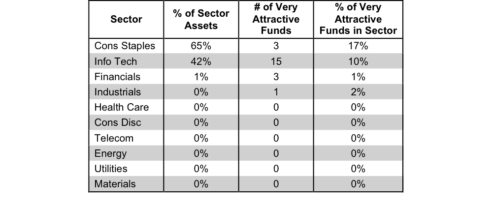
Source: New Constructs, LLC and company filings
Figure 6 presents a mapping of Attractive funds by sector. The chart shows the number of Attractive funds in each sector and the percentage of assets allocated to Attractive-rated funds in each sector.
Figure 6: Attractive ETFs & Mutual Funds by Sector
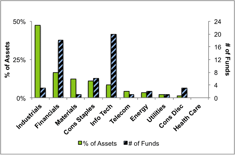
Source: New Constructs, LLC and company filings
Figure 7 presents the data charted in Figure 6.
Figure 7: Attractive ETFs & Mutual Funds by Sector
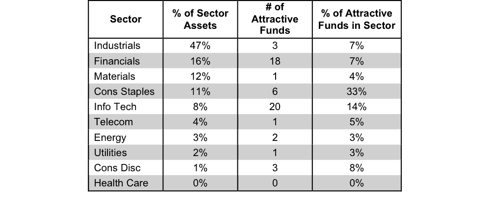
Source: New Constructs, LLC and company filings
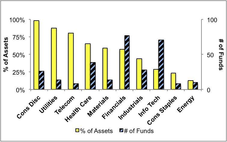
Figure 8 presents a mapping of Neutral funds by sector. The chart shows the number of Neutral funds in each sector and the percentage of assets allocated to Neutral-rated funds in each sector.
Figure 8: Neutral ETFs & Mutual Funds by Sector
Source: New Constructs, LLC and company filings
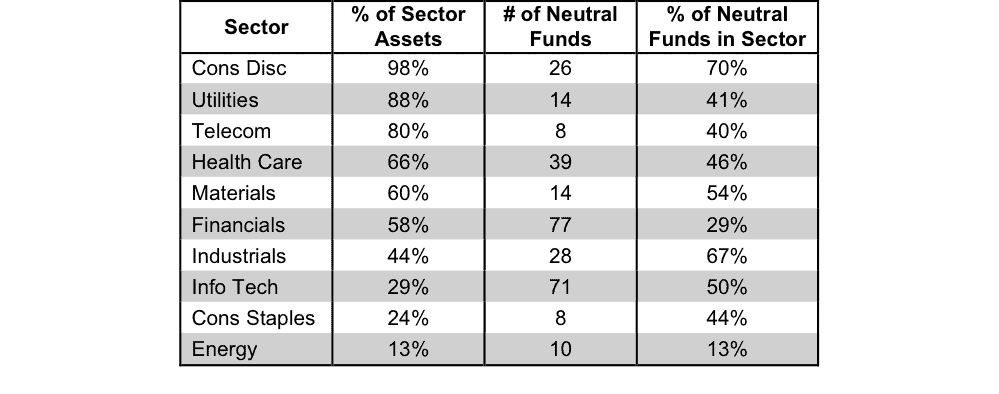
Figure 9 presents the data charted in Figure 8.
Figure 9: Neutral ETFs & Mutual Funds by Sector
Source: New Constructs, LLC and company filings
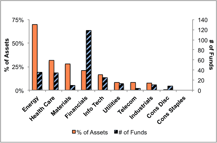
Figure 10 presents a mapping of Dangerous funds by fund sector. The chart shows the number of Dangerous funds in each sector and the percentage of assets allocated to Dangerous-rated funds in each sector.
The landscape of sector ETFs and mutual funds is littered with Dangerous funds. Investors in Energy funds have put over 70% of their assets in Dangerous-rated funds.
Figure 10: Dangerous ETFs & Mutual Funds by Sector
Source: New Constructs, LLC and company filings
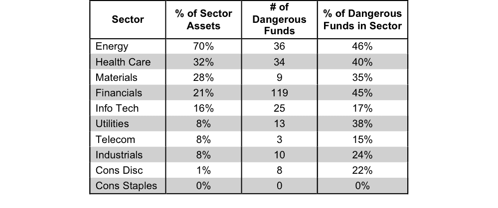
Figure 11 presents the data charted in Figure 10.
Figure 11: Dangerous ETFs & Mutual Funds by Sector
Source: New Constructs, LLC and company filings
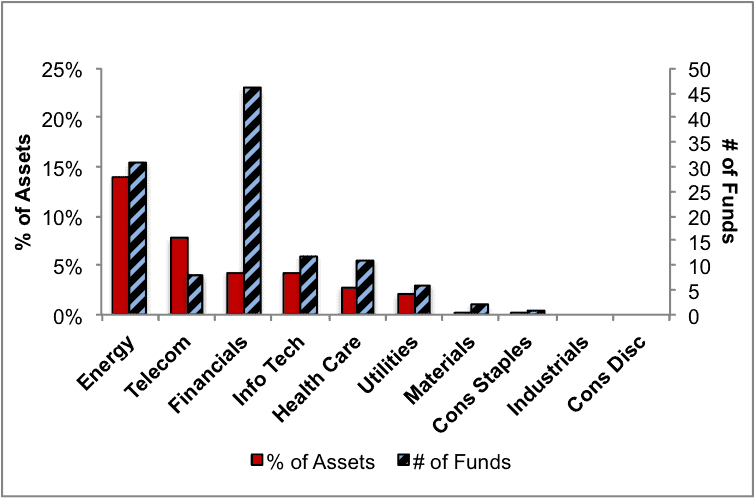
Figure 12 presents a mapping of Very Dangerous funds by fund sector. The chart shows the number of Very Dangerous funds in each sector and the percentage of assets in each sector allocated to funds that are rated Very Dangerous.
Figure 12: Very Dangerous ETFs & Mutual Funds by Sector
Source: New Constructs, LLC and company filings
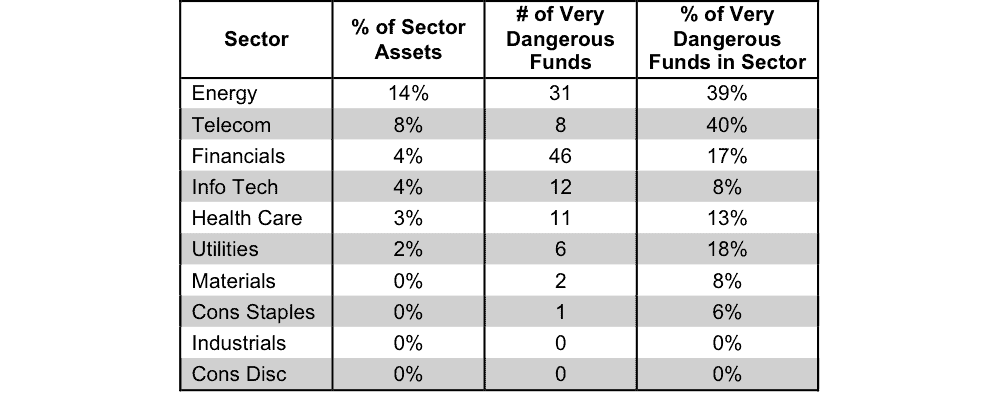
Figure 13 presents the data charted in Figure 12.
Figure 13: Very Dangerous ETFs & Mutual Funds by Sector
Source: New Constructs, LLC and company filings
Disclosure: David Trainer and Kyle Guske II receive no compensation to write about any specific stock, sector or theme.
2 replies to "4Q15 Sector Ratings for ETFs & Mutual Funds"
in the free version the website indicates that you can research the best and worst mutual funds in each category……I am having a difficult time finding and accessing this information….can you help?
Fund research is here:
https://www.newconstructs.com/category/sector/ and
https://www.newconstructs.com/category/style/